The Uncomfortable Truth.
Launched in 2023, The Uncomfortable Truth brings raw conversations about belief and conviction to an audience hungry for more than clichés.
The show quickly built a loyal audience by confronting the hard conversations most avoid. With a tone that is raw, honest, and unflinching, it bridges conviction and culture while giving listeners a space for truth without compromise.
As the audience grew, so did the vision. The Uncomfortable Truth needed to evolve from a podcast into a lifestyle platform — one that could thrive across social feeds, garments, and commerce while staying true to its mission.
To grow beyond the mic, The Uncomfortable Truth needed a brand with backbone — one that could thrive in feeds, on shirts, and in stores.
Brand Approach
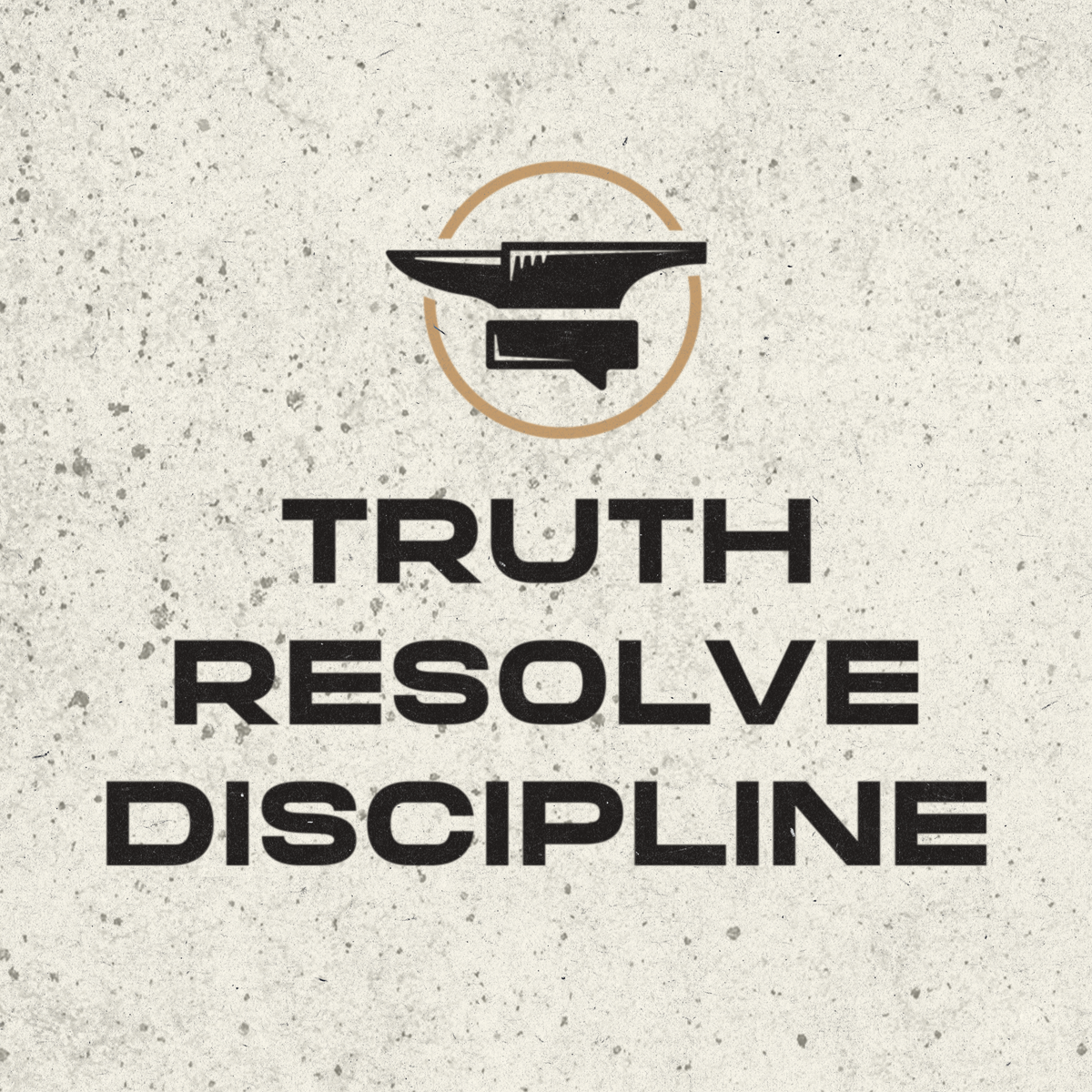
The Uncomfortable Truth needed more than a mark — it needed a system. Its voice couldn’t be captured by a logo alone. We started with the principles that define the podcast — Truth. Resolve. Discipline. — and translated them into design cues that would guide the entire identity. The result was a foundation tough enough to thrive in noisy feeds, flexible enough to fuel recurring merch drops, and clear enough to anchor a growing storefront.
This wasn’t about “church merch” or disposable podcast graphics. It was about forging a brand that felt credible in streetwear, recognizable online, and true to the message behind the mic. From the anvil-inspired logo to the capsule-ready garments and the no-nonsense social kit, every decision was made to carry the same weight as the conversations that inspired them.
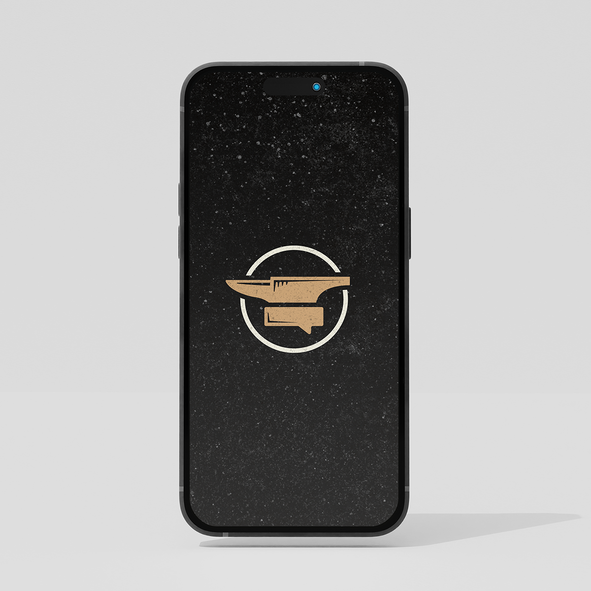
Crafting the Logo
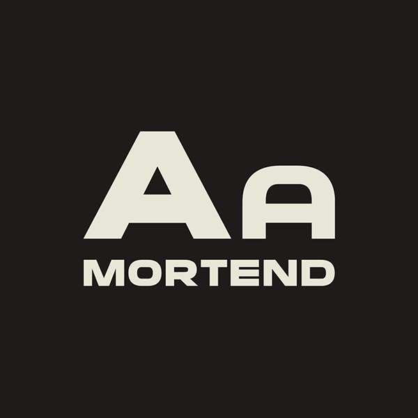
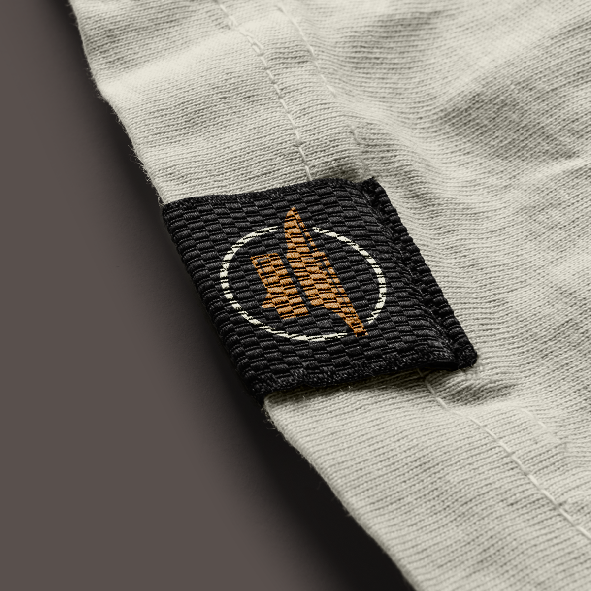
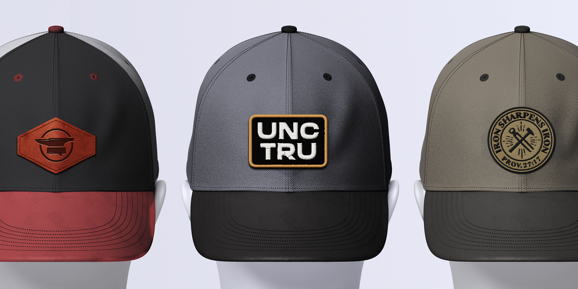
The Uncomfortable Truth needed a mark as strong as its name. Built on the anvil — a symbol of durability and craft — the logo also nods to conversation and faith through subtle cues of a chat bubble and cross. The result is a clean, versatile mark that carries weight without losing clarity.
Through exploration and refinement, we developed a system that works everywhere the brand shows up. From podcast icons to embroidered patches, the logo is bold, flexible, and unmistakably tied to The Uncomfortable Truth.
Visual Identity
The logo is only the starting point. To make the brand scalable, we built a visual system that carries the same weight as the conversations behind it.
The palette is intentionally simple: a high-contrast pairing of dark and light tones. A gritty texture adds depth and edge in digital applications, giving the brand a raw honesty that mirrors its voice. For promotional products and physical applications, the mark stands clean — crisp vector art designed to adapt seamlessly to garments, stickers, and merchandise.
Typography follows the same logic: bold, legible forms for headlines paired with straightforward body type that keeps the message clear.
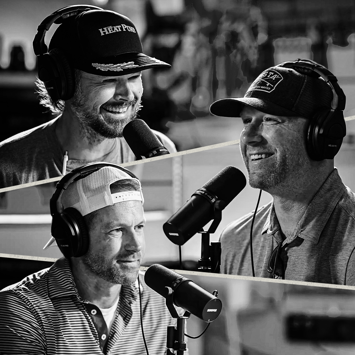
We also created a supporting shorthand mark, UNCTRU, for garments and secondary branding. This compact version extends the system while staying unmistakably tied to the brand’s foundation. Black-and-white portraits of the hosts and guests further reinforce the raw, unfiltered voice of the show.
Stripped of color and pretense, black-and-white portraits capture the grit of conversation — every line, every truth, every voice laid bare.
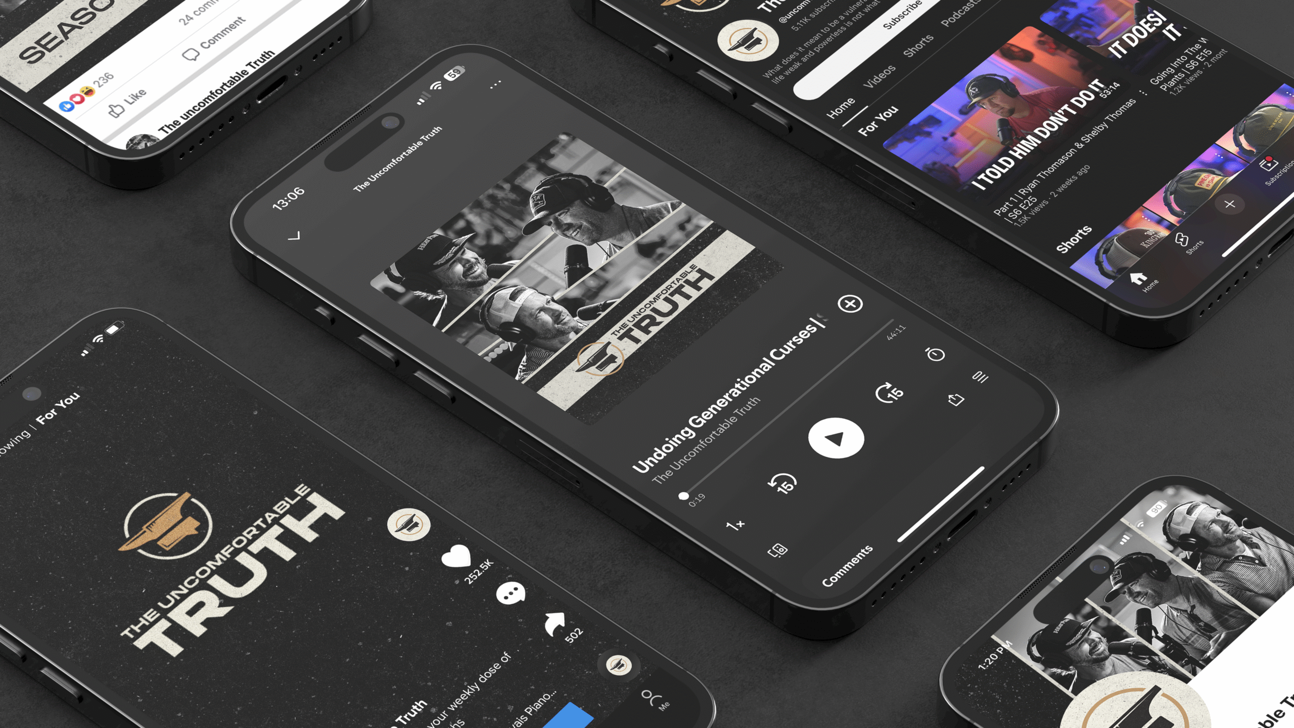
Social Kit
The Uncomfortable Truth needed a consistent look across every channel. We built a social kit that extended the brand into profiles, banners, and podcast covers — ensuring recognition and cohesion wherever the audience engaged.
From bold avatars to gritty headers, the system was designed for speed and repeatability. Each asset reinforced the identity while giving the team an easy-to-use toolkit for ongoing content.
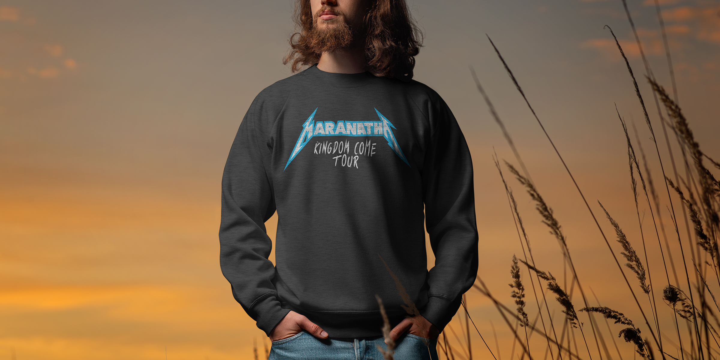
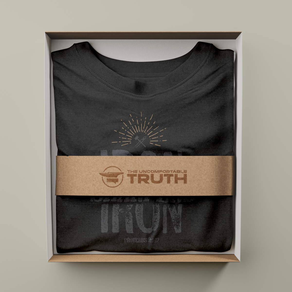
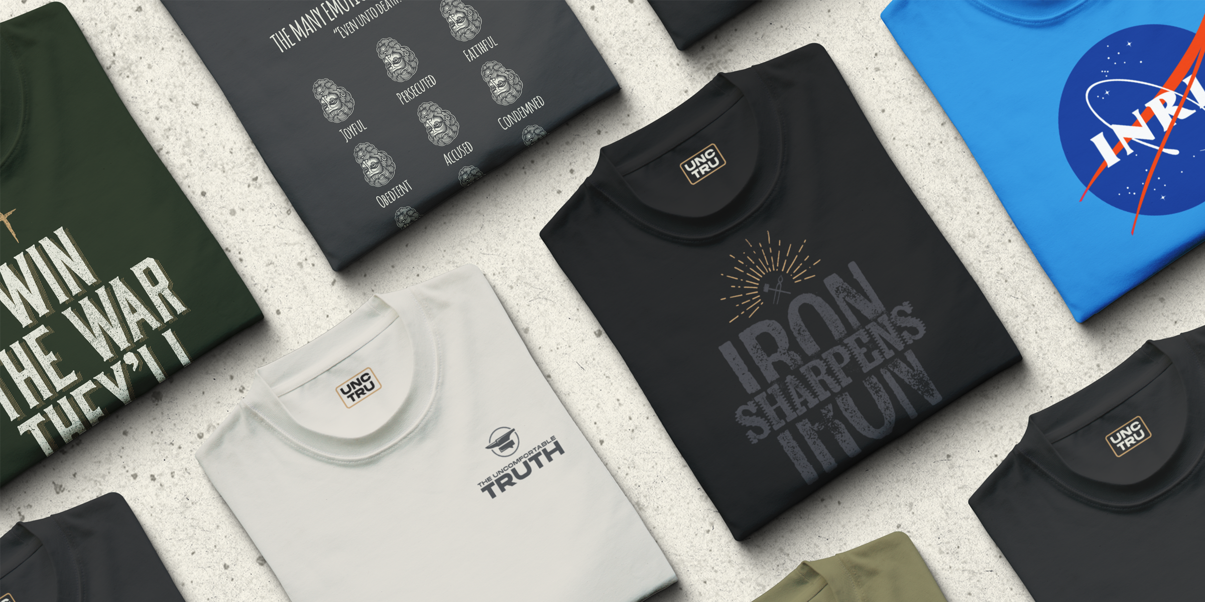
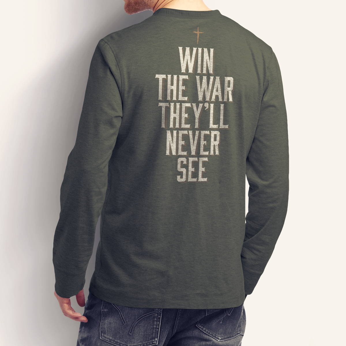
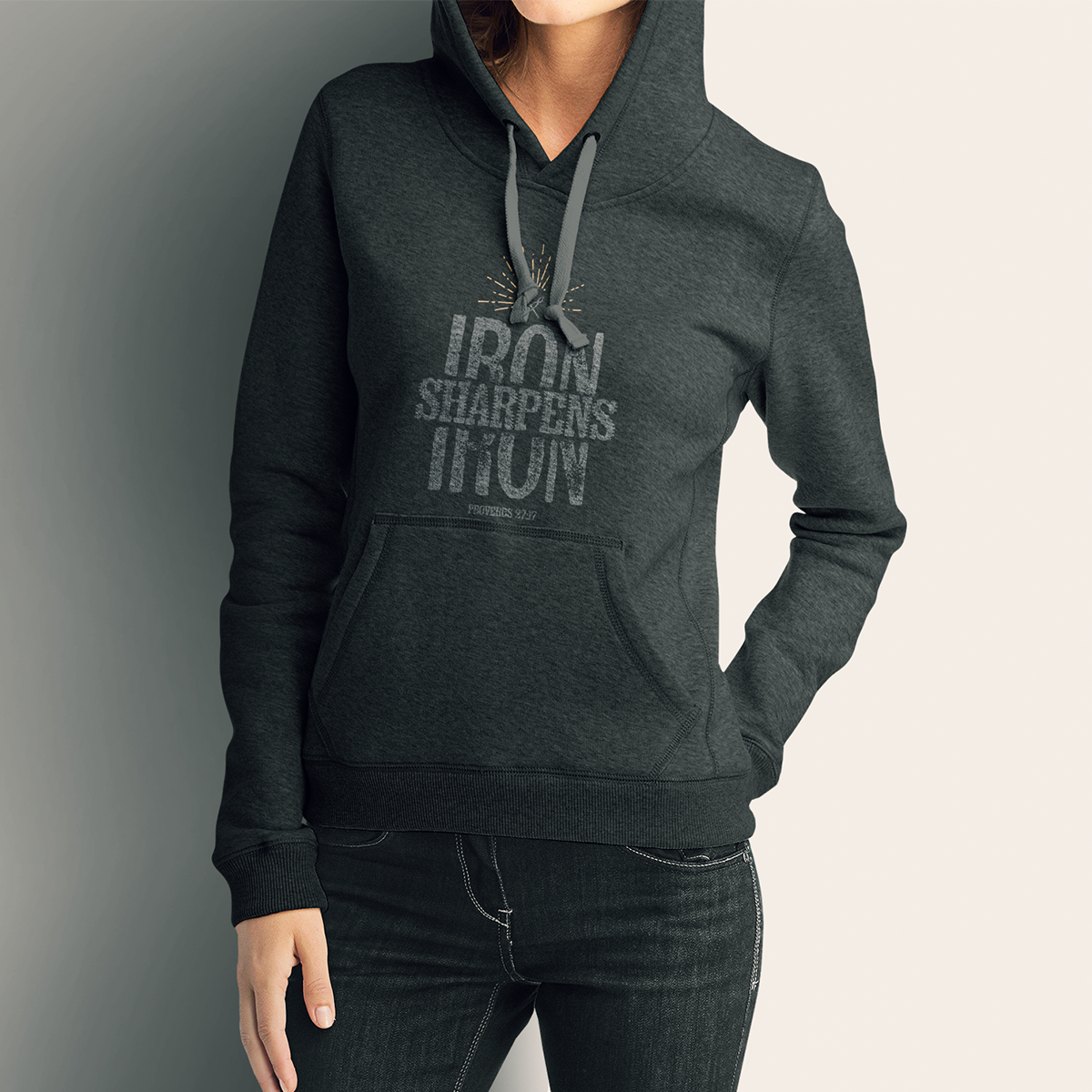
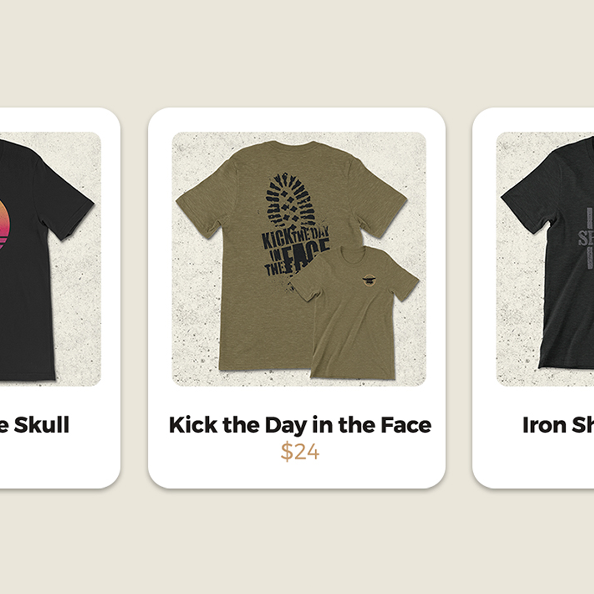
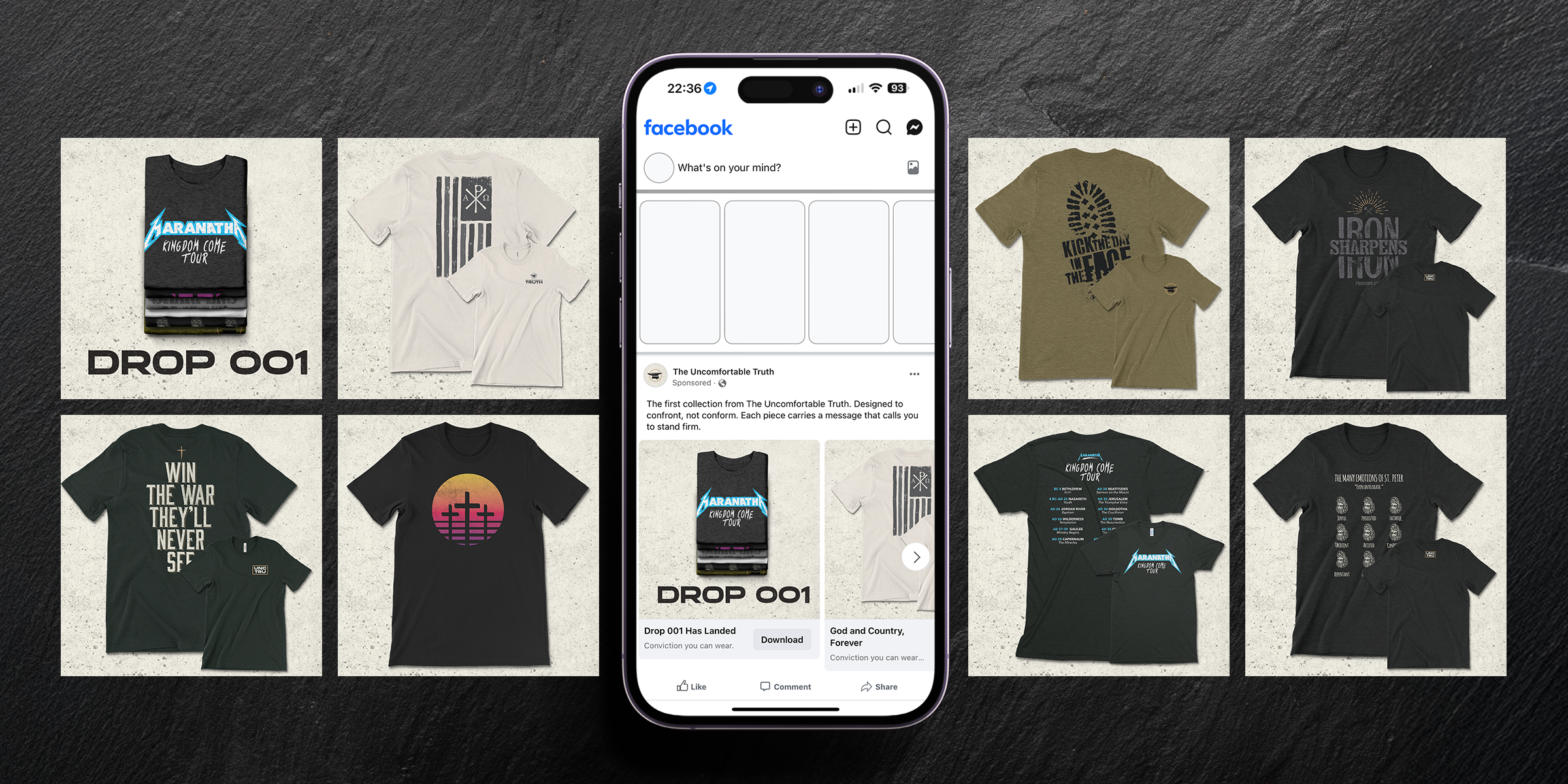
Garments & Merchandise
The Uncomfortable Truth wasn’t looking for typical podcast merch. Each piece needed to stand on its own design — something people would wear with pride, even outside the context of the show. We built the collection like a capsule drop, creating shirts, hats, and patches that carried the same principles as the brand: bold, disciplined, and direct. Every concept was designed to work individually while still feeling unmistakably part of the TUT system.
From Iron Sharpens Iron to Kick the Day in the Face, the designs turned the voice of the podcast into pieces ready for everyday wear. Production-ready artwork ensured clean results across screen printing, embroidery, and patch applications, giving the brand tools it could take straight to market.
Campaigns & Commerce
The Uncomfortable Truth needed a digital home to host its growing brand. We designed and launched a Shopify storefront that carried the same bold identity into a clean, functional experience.
The site gave listeners a direct line to support the show, browse new drops, and shop with ease — all while staying rooted in the look and feel of the podcast.
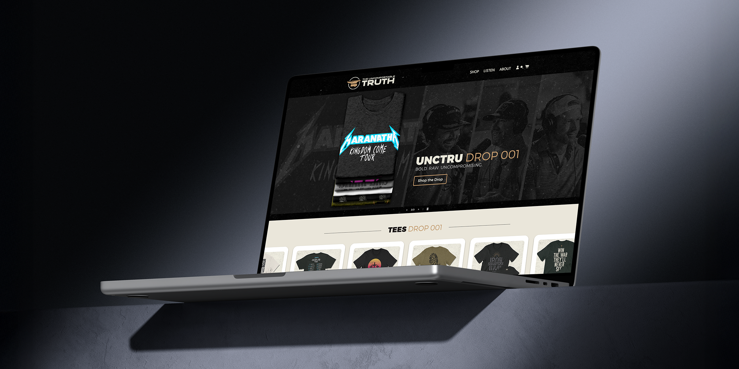
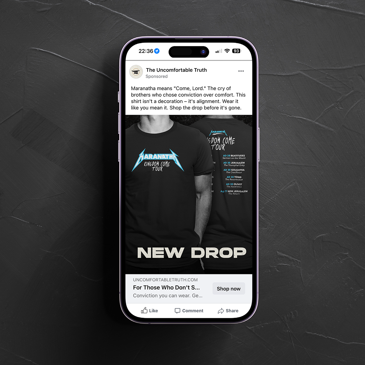
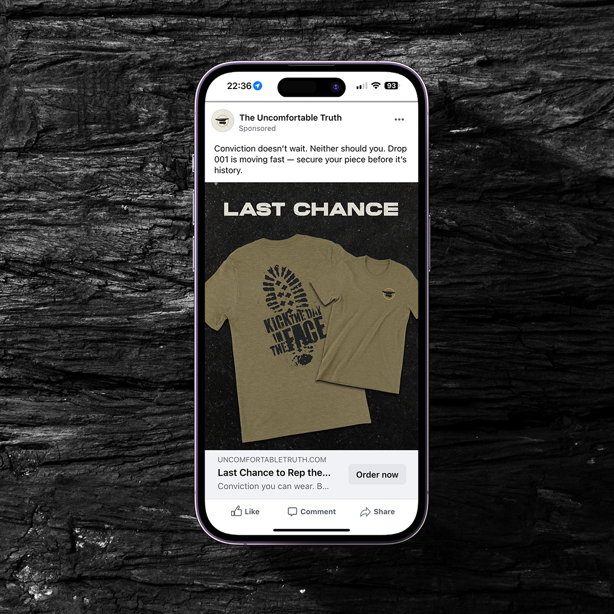
Campaign Support
Each merch drop was paired with campaign-ready assets that extended the brand into social and digital advertising. Bold graphics, gritty textures, and straightforward calls to action created momentum and consistency.
Designed to work seamlessly with the storefront, these campaigns made the path from feed to checkout simple and direct.

Impact
The Uncomfortable Truth now has a brand system built to scale. What began as a podcast identity grew into a full platform — from a crisp, versatile logo to a gritty visual system that extends across social, digital, and physical touchpoints. Every element was designed to reflect the brand’s principles of Truth, Resolve, and Discipline, giving the show a look as bold and unflinching as its voice.
With a social kit for ongoing content, a Shopify storefront, campaign assets, and capsule-ready garments, the brand now operates with consistency and confidence. The Uncomfortable Truth has the tools to grow its community, expand its reach, and carry its message well beyond the mic.
“What I’m most satisfied with is the connection that we’ve made. The team at Primer is interested in understanding you as a person as well as the goals of your business, so that they can execute your vision. It’s been a very refreshing process, and I would encourage you to lean on them as we have.”
Shane Goswick, Founder, The Uncomfortable Truth
Services
Brand Strategy & Positioning • Logo & Identity Design • Visual Identity System • Social Media Kit & Channel Branding • Apparel & Merchandise Design • Shopify E-Commerce Storefront Design • Campaign Creative & Digital Advertising Support